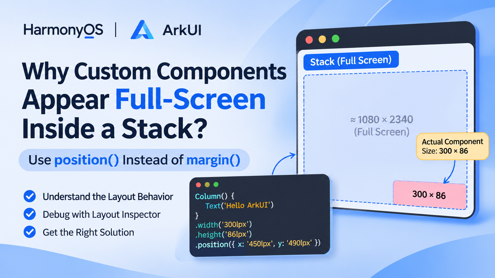
HarmonyOS ArkUI: Why Custom Components Appear Full-Screen Inside a Stack
When developing applications with HarmonyOS ArkUI, you may encounter an unexpected layout issue: a custom component is placed inside a Stack, but when inspecting the view hierarchy using Layout Inspector, its dimensions appear to cover the entire screen.
However, the actual UI content is much smaller. For example, a component designed to be only 300 × 86 lpx may appear to occupy the full screen in the layout inspection tool.
This article explains the possible causes of this behavior and demonstrates how to solve it using position() instead of large margin() values.
1. Understanding the Problem
Consider a custom component with the following layout:
- Width: 300 lpx
- Height: 86 lpx
- Horizontal position: 450 lpx
- Vertical position: 490 lpx
The component is intended to appear at a specific location on the screen, with a fixed size.
A simplified implementation might look like this:
@Component
export struct FloatingComponent {
  build() {
    Column() {
      Text('Floating Component')
        .fontSize(20)
    }
    .width('300lpx')
    .height('86lpx')
    .backgroundColor(Color.Pink)
    .margin({
      left: '450lpx',
      top: '490lpx'
    })
  }
}
When this component is placed inside a Stack, the actual visual content may look correct, but the component’s layout boundaries in Layout Inspector may not match the expected 300 × 86 dimensions.
This makes it difficult to understand the component’s actual size and positioning.
2. Why Does This Happen?
There are several layout concepts worth understanding.
2.1 Stack Layout Behavior
Stack is a container that allows multiple child components to overlap.
Its children are positioned relative to the Stack’s layout area. If the Stack is the root container of a page, its dimensions will generally correspond to the available page area.
For example:
Stack() {
  FloatingComponent()
}
.width('100%')
.height('100%')
Here, the Stack occupies the available screen area.
However, this does not necessarily mean that every child component must occupy the same dimensions.
A child component can have its own explicit width and height.
2.2 Margin Affects Layout Space
The main issue in the example is the use of large margin values to control the component’s screen position.
.margin({
  left: '450lpx',
  top: '490lpx'
})
margin is intended to define spacing around a component as part of layout.
It is not designed to serve as an absolute positioning mechanism.
Large margins can affect the layout space and positioning calculations, making the resulting layout boundaries different from the visible content boundaries.
This is particularly confusing when inspecting nested custom components.
One important distinction: the size shown for a custom component node and the size of its internal root layout node are not necessarily the same. Always inspect the actual root container before concluding that the visible component itself occupies the entire screen.
2.3 Custom Components Have Their Own Layout Boundaries
A custom component declared with @Component is a reusable UI structure.
Its actual layout is determined by its internal root component, its parent constraints, and the layout properties applied at the call site.
For example:
@Component
export struct FloatingComponent {
  build() {
    Column() {
      Text('Hello ArkUI')
    }
    .width('300lpx')
    .height('86lpx')
  }
}
The internal Column has an explicitly defined size.
When debugging, distinguish between:
- The custom component’s layout node.
- Its internal root container.
- The actual visible content.
These boundaries may provide different information in Layout Inspector.
3. Recommended Solution: Use position() Instead of margin()
For this particular scenario, position() is a more appropriate solution.
Instead of using large margins to move a component around the screen, use explicit positioning.
Before: Using margin()
@Component
export struct FloatingComponent {
  build() {
    Column() {
      Text('Hello ArkUI')
    }
    .width('300lpx')
    .height('86lpx')
    .backgroundColor(Color.Pink)
    .margin({
      left: '450lpx',
      top: '490lpx'
    })
  }
}
After: Using position()
@Component
export struct FloatingComponent {
  build() {
    Column() {
      Text('Hello ArkUI')
    }
    .width('300lpx')
    .height('86lpx')
    .backgroundColor(Color.Pink)
    .position({
      x: '450lpx',
      y: '490lpx'
    })
  }
}
The key change is:
.position({
  x: '450lpx',
  y: '490lpx'
})
Unlike margin-based spacing, position() controls the component’s position without using large margins to create the same visual offset.
This makes the layout intention clearer and avoids unnecessarily introducing large spacing values into the layout.
Note that the exact positioning reference and resulting coordinates depend on the parent container and ArkUI layout rules.
4. Alternative: Let the Parent Stack Control Positioning
Another approach is to separate component layout from positioning logic.
The custom component only defines its own appearance and dimensions:
@Component
export struct FloatingComponent {
  build() {
    Column() {
      Text('Hello ArkUI')
    }
    .width('300lpx')
    .height('86lpx')
    .backgroundColor(Color.Pink)
  }
}
The parent component controls its position:
@Entry
@Component
struct Index {
  build() {
    Stack() {
      FloatingComponent()
        .position({
          x: '450lpx',
          y: '490lpx'
        })
    }
    .width('100%')
    .height('100%')
  }
}
This approach provides a clearer separation of responsibilities:
- Custom component: Responsible for its own UI and dimensions.
- Parent Stack: Responsible for positioning and composition.
It is particularly useful when the same custom component needs to be reused in different locations.
5. Margin vs. position vs. offset
Although these three properties can all affect where a component appears, they serve different purposes.
| Property | Purpose | Typical Use |
|---|---|---|
| margin() | Defines external spacing around a component | Layout spacing |
| position() | Specifies the component’s position relative to its parent | Explicit positioning |
| offset() | Adjusts the component’s displayed position relative to its original position | Small visual adjustments |
A practical guideline:
- Use
margin()when you need spacing between components. - Use
position()when you need to place a component at a specific coordinate. - Use
offset()when you want to visually shift a component without changing its original layout position.
Avoid using large margins as a substitute for absolute positioning.
6. Practical Debugging Checklist
When a custom component unexpectedly appears full-screen in Layout Inspector, check the following:
- Inspect the internal root component. Make sure its width and height are explicitly defined.
- Check parent constraints. Determine whether the parent Stack or another container is imposing full-screen dimensions.
- Check margin values. Look for large horizontal or vertical margins that may affect layout calculations.
- Replace positioning margins. Try using
position()for components that need to appear at specific screen coordinates. - Inspect the component at different hierarchy levels. Compare the custom component node with its internal root layout node.
- Verify the actual rendered bounds. Do not rely solely on the dimensions displayed for the custom component wrapper.
7. Conclusion
When placing custom components inside a HarmonyOS ArkUI Stack, an unexpected full-screen size in Layout Inspector does not necessarily mean that the component’s visible content is actually full-screen.
The important thing is to distinguish between the custom component’s layout boundaries and its internal root container.
For components that need fixed dimensions and specific screen coordinates, the recommended approach is:
- Define explicit width and height on the internal root component.
- Avoid using large
margin()values for positioning. - Use
position()to control the component’s coordinates. - Keep positioning responsibilities in the parent Stack when the component needs to be reusable.
This makes the layout structure easier to understand, maintain, and debug.